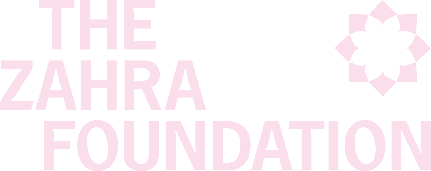
How our brand is evolving for a bright future.
Our team and our community have collaboratively worked towards crafting a representation of The Zahra Foundation that truly encapsulates and communicates the essence of our mission, our purpose and the journey we embark upon with every woman who seeks our support. We invite you to learn about our evolved identity.
The Lotus & The Light
The dawn of a new day brings hope and new beginnings, it is when the lotus flower blooms. Lotus flowers grow towards the sun and emerge from dark, cold, murky waters. A symbol of Zahra being the light that provides hope and empowers survivors to find pathways to independence and build a life free from poverty and abuse. Zahra brings women into a circle of a supportive and non-judgemental community where they can find the strength to take the next steps in their recovery journey.
At the heart of our new brand identity is the Lotus Shamsa, a powerful symbol of resilience, growth and transformation. Just as the lotus blooms from the murky waters, our foundation serves as a safe space where women can find solace, courageously open up, and thrive despite adversity. The lotus petals, meticulously arranged to form a radiant sun are symbolic of Zahra being the light, illuminating a path towards empowerment. Moreover, the eight petals of the lotus hold profound cultural significance, representing prosperity, strength, and the interconnectedness of all life. Each petal embodies the diverse pathways to recovery from domestic abuse, acknowledging the unique journey of every woman we support.
Embedded within our brand identity is also a circle of women, reminiscent of a yarning circle—a sacred space where individuals come together to connect, listen, and uplift one another. This symbolises the importance of community, solidarity, and collective impact in overcoming adversity.
Furthermore, our brand identity incorporates elements that pay homage to Zahra and her Persian heritage. The typography, with its subtle gestures and hints of Persian influence in each character, exudes strength and fortitude. This deliberate choice reflects our commitment to honouring Zahra, while embracing growth and evolution as The Zahra Foundation continues to do everything possible to create change, inspire movements, increase understanding and work towards breaking the cycle of domestic abuse.
In addition, our versatile colour palette not only evokes a sense of familiarity with our foundation but also signifies progression. Our vibrant brand highlight colours embrace diversity and inclusivity through a rich mix of visual representation and patterns. These intricate designs reflect the multifaceted nature of our team and the individuals we support, showcasing the beauty in our differences and the strength in our unity. Through our brand identity, we affirm our dedication to uplifting and empowering every person who walks through our doors.
As we unveil this new brand identity, we reaffirm our commitment to providing unwavering support to survivors of domestic abuse. Our foundation remains steadfast in its dedication to fostering a society where every woman is empowered to chart her own path towards a brighter future.
Together, let us continue to stand in solidarity, uplift one another, and illuminate a way forward.


